New Work

Fugue in Four Voices

I so enjoyed making my Fugue in Three Voices that I decided to try one in four voices. I wanted to address an aesthetic that I did not achieve in the three voice fugue. With this one, I’m still not quite there. The challenge is to balance the desired aesthetic with a fugue structure. I’m not trying to be exactly true in its fugueness, but true enough to make it fugue-y. (Makes sense, right?)

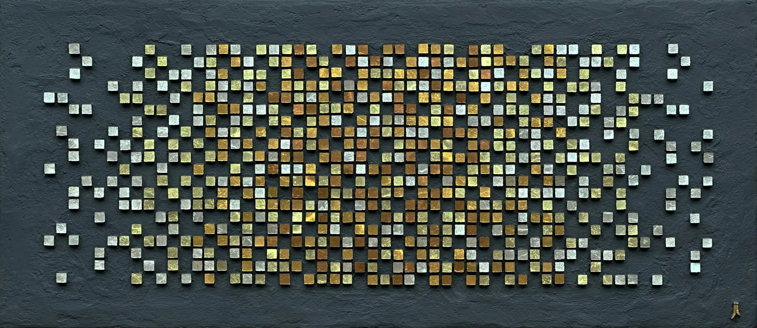
Fugue in Four Voices (2025) 11” x 27” | 28cm x 69cm. Mosaic gold (Orsoni 002 006, 010, 014), charcoal cement

How This Fugue Works

For a little more info about fugues in general, refer to my Fugue in Three Voices post.

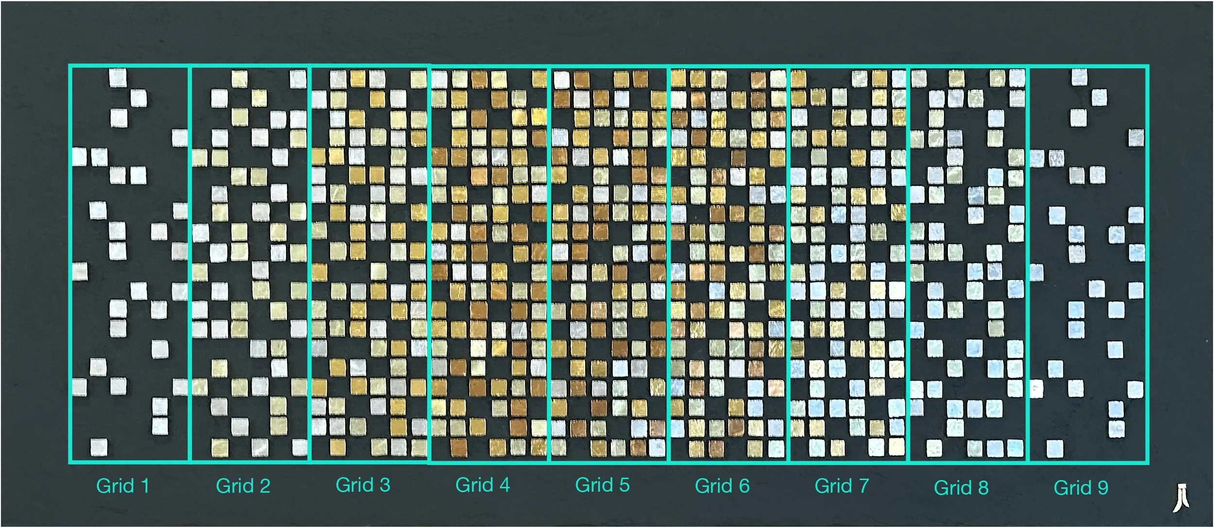
This fugue is made up of nine 6 x 20 grids.

The voices are as follows:

1st voice - white gold (Orsoni 002 gold which appears white relative to the other shades)

2nd voice - pale yellow (Orsoni 006 gold)

3rd voice - gold (Orsoni 010 gold)

4th voice - light copper (Orsoni 014 gold)

The exposition is as follows:

Grid 1 - 1st voice introduces the subject

Grid 2 - 2nd voice enters with the subject; 1st voice is countersubject

Grid 3 - 3rd voice enters with the subject; 2nd voice is countersubject; 1st voice is free counterpoint

Grid 4 - 4th voice enters with the subject; 3rd voice is countersubject; 2nd and 1st voices are free counterpoint

The exposition is complete once the 4th voices enters. The remainder of the fugue is as follows:

Grid 5 and 6 - episodes in all four voices

Grid 7 - episode in first 3 voices

Grid 8 - episode in first 2 voices

Grid 9 - 1st voice ends the fugue with the original subject

After the first of the year, I want to try a fugue in five voices. I’m still trying for a better/different balance between the aesthetic and the fugue structure, and I am loving the challenge. There are fugues in seven voices but I’m going to stop at five; it gets really confusing working with multiple shifting voices. I’ve been working on the five-voice design in which my current plan is to use 13 grids, each 5 x 30. Regardless of whether or not I achieve the aesthetic for which I am striving, it will at least be very pretty: Orsoni gold is a treat to work with!

Green Fire


Above: Green Fire 10” x 6” Marble, mosaic gold, porcelain, ammolite specimen

My friend Tracy Hodson is visiting for a few days and we decided to each make a small mosaic. I’m recovering from foot surgery and wanted to work casual: very relaxed and loose.

I bought a couple of ammolite specimens while in western Canada and wanted to use one of them for this mosaic. They are very sensitive to the light so very challenging to photograph. Here are some detail shots of the ammolite to give you a better idea:

About Ammolite:

“Ammolite is the coloured gemstone that comes from Canadian ammonites with a distinct, and vibrant rainbow colour. Globally, these are only found along the St. Mary River, south of Lethbridge, in Western Canada. This stunning iridescent gem, received its official gemstone status by the World Jewelry Confederation in 1981.” —Ammolite Museum Find out more.

In Wait

My next project has been in wait for over 3 years now, waiting for me to literally fill in between the lines. Now that I’m back in my studio again, I’ve decided how to finish these out. I settled on a couple of shades of Orsoni gold: 002 and 006. Stay tuned…

Pair of tequila bottles 12" x 3"

Eden's Promise

This is a piece I started about 3 or 4 years ago. It needed a little rethinking, which I managed to conjure up a few months ago. The background andamento was a nice challenge for me, as well as the soft gradation in the middle section.

Eden’s Promise (2024) 19.5” x 15” Smalti, marble and travertine, shale, mosaic gold

Eden’s Promise, with reflection

OSU Commission, № 1 of 5

So, that potential commission that I blogged about did come through after all. It was a bit of a lengthy, touch-and-go kind of process, and I actually thought it had gone and was not going to happen. But then, after another month, I heard from them and they were ready to move on it.

Oklahoma State University is developing a medical complex in downtown Tulsa. It is not complete yet, but they wanted mosaics of the skyline with the actual and future OSU buildings. It was not easy to get the right view as the complex is rather spread out. They wanted five “table top” pieces, which they defined as being as much as 24” wide. Eventually, they were able to get a couple of good Google Earth images from which I could work.

Below is the image that I used to create the to-scale drawing that follows. The Google Earth image was very small, however, and it was tricky to translate some of the buildings and/or features. In a 9” x 24” mosaic, on their time frame and within their budget, I could not get very detailed. We needed to bring out the OSU buildings and visually tie them together, even though the complex is not finished. So I honed in on the OSU orange and used it, along with more detail, to help make the OSU buildings visually prominent. So all the front buildings with the bright orange are the OSU buildings. The background buildings that look a paler orange are actually more of a terra cotta color, which you can see in the finished first mosaic.

Google Earth image

My rendering of the Goggle Earth image, created using the Procreate app. This rendering included some future construction

Initially, they wanted all five—gifts for donors—by Christmas, but I was not comfortable committing to that. So they asked for three of them by Christmas. Confident that I could do that, and with an approved budget, we signed a contract, effective Oct. 1.

I started the first one (below) before Oct. 1, as I had material on hand and really wanted to get a good idea of how much time I needed, how much detail I could manage, and generally work out any issues. I am now starting the second one.

Tulsa/OSU Skyline 9“ x 24” | 23cm x 61cm. Vitreous glass. Digitally framed.

The vitreous glass is a mix of French Opio and Italian Bisazza, and also Trend. Yes, that Bisazza is old, as well as the Opio, neither of which are available now, although Bisazza is basically Trend now, if I have that right. I priced the work for them using either vitreous or smalti and they chose the vitreous. It is less expensive, I had a good amount in inventory, and I thought it more practical for this project, considering the time issue. I knew I would be using a lot of straight cuts and thought vitreous would be a little easier—translate to faster—than smalti. Still, vitreous has its own issues, like dealing with those darned mitered edges. And the Opio is the hardest vitreous I have every worked with!

The only issue that I encountered was the grout. I was hoping to use a single color for the sky as for the non-sky, but after grouting it all in a mix of half gray thin set and half white, I thought the sky grout lines were a little too dark. However, I did not want to go any lighter for the non-sky part. I felt like it was important for the grout lines to show to help give definition for the buildings and the mid-gray works well for the buildings, whether light or dark. So I reworked the sky grout using 2-1 parts of white to gray thin set and was much happier with it.

Their initial idea was for the five smaller panels, and then a very large one to be installed in one of the buildings. I don’t think the idea for the large mosaic has been settled upon yet.

End-of-Malaise Bottle?

Since last November, I’ve been totally lacking in mosaic motivation. I attempted a couple of projects only to leave them lingering on my work table, destined to be abandoned. At first, I was a little concerned, but I decided to just go with it and see what happened. If, after some unidentified period of time, I still lacked mosaic mojo, so be it. I’ve just been living life without mosaicking for almost a year, and it has been a very productive time, just not mosaically.

Then, a few of weeks ago, I invested a good chunk of my weekend on a possible commission design. The potential client had been trying to work out a project for months. Each time I thought I would not hear from them anymore, I would hear from them. So, once again, they contacted me and I really did want to help them resolve things, moving ahead with or without me.

I prepared a design with which I could give good cost and time estimates and sent it to them. I highly suspected it was beyond their budget as well as time frame, but I gave it my best shot. Not having heard back from them, I am once again guessing that they have moved on without me.

Spending the time on that design was very good for me, however, and I think it helped to prod me back to mosaic. Well, time will tell about that. Anyway, I decided to mosaic a bottle while I was developing an art piece idea. And here is the bottle.

Amber, Copper, and Gold Bottle 8.5” x 4” | 22cm x 10cm. Vitreous, mirror and Van Gogh glass on Hendrick’s gin bottle.

The main shape of the bottle was easy to work with. The 1/4” squares were cut to size by Mosaics By Maria. The top, however, proved to be a little more demanding. I ended up having to wedge most of the top pieces. It’s not my favorite palette, but I the materials left over from something else.

It did actually feel good to have a project again, and I think I am ready to move on to the art piece. Perhaps my mosaic doldrums have come to an end? Let’s find out!

Study in Moderation № 10

Previous Posts

This is the final piece for this study. I had intended to do two more but I’ll explain in my next post. I’ll also opine about this project and how I think it went.

That is a very dark orange mosaic gold plate that I used.

Study in Moderation № 10 (2020) 7” x 9” | 18cm x 23cm. Marble, mosaic gold, smalti transparenti.

Study in Moderation № 10, alternate lighting

Study in Moderation № 10, detail

Study in Moderation № 9

Previous Posts

I have a few gold plates leftover from my Theme and Variations: All Dreams that I finished earlier in the year, and they rather stumbled me upon this idea. I’m thinking that I will follow this theme for the remaining three studies.

Study in Moderation № 9 (2020) 7” x 9” | 18cm x 23cm. Marble, mosaic gold, smalti.

Study in Moderation № 9, alternate lighting

Study in Moderation № 9, detail

Study in Moderation № 8

I think I’m getting the hang of it!

Study in Moderation № 8 (2020) 9” x 7” | 23cm x 18cm. Marble, mosaic gold, decorative ceramic, shell. Digitally framed.

Study in Moderation № 8, alternate lighting

Previous Posts

Currently, I’m planning on making four more and then moving on to something a little more serious. But these have been fun and very worthwhile. It will be interesting to see how I might incorporate this more relaxed execution into my next large work later in the year.

Study in Moderation № 8, detail

Study in Moderation № 7

Finally, I was able to get a more relaxed execution with a flowing andamento. I like the way this one turned out.

Study in Moderation № 7 (2020) 9” x 7” | 23cm x 18cm. Marble, smalti, turquoise, mosaic gold.

Alternate lighting

Previous Posts

I would not normally combine purple and turquoise, but I found it very striking with the black marble.

I’m framing all of these little studies in black metal floater frames. I like having a frame on my pieces primarily for handling. These frames are not very expensive and the are not permanently attached to the work.

Study in Moderation № 7, detail

Study in Moderation № 5

Previous Posts

Oh my! I’ve got some serious loose going on here.

Study in Moderation № 5 (2020) 9” x 7” | 21cm x 18cm. Marble, smalti, framing spring clips.


I was talking with my musician son about my objective for these studies, and how I really feel like I am relaxing my technique as I work, but then they still look too controlled. He shared with me some advice that his college piano professor gave him when he was trying to develop a new playing technique. The advice was to really exaggerate it to the point where it feels too exaggerated, and then it would be right.

On this one, I followed that advice. What do you think?


Study in Moderation № 5, side perspective

Study in Moderation № 5, side perspective


Study in Moderation № 4

Previous Posts

After further consideration, I have concluded that the previous piece, #3, is a bit of a setback from #2 with regard to my objective of loosening up. I’m just amazed—and amused— at how challengingly this whole loosening up experiment is going.

Study in Moderation № 4 (2020) 9” x 7” | 23cm x 18cm. Granite, sodalite, smalti, framing spring clips. Indirect, exterior lighting from above.

interior lighting

I did the smalti first and almost tore out that circular, sun-like area; I thought it was TOO loose, too sloppy. I had decided to do that but forced myself to leave it be. Such discipline! 😎 I chose this andamento because I wanted to be able to compare it to #1, and I believe this comparison does show some progress. What do you think? Maybe I am just seeing what I want to see.

Study in Moderation № 4, indirect exterior lighting from above

Study in Moderation № 1

I am encouraged with this #4. It has the degree of looseness as does #2, although the cuts still look too neat, too controlled. I am confident that I have not backtracked. On to #5.

Study in Moderation № 4, side perspective